Audiens · 2023
Improving product growth by 14x
Introduction
Audiens is a Shopify app that helps small and medium-sized businesses segment their customers using data, to suggest the most impactful email campaigns to send.
Segmentation allows for personalised communication with customers, however many business owners lack the time and expertise to regularly carry out segmentation, instead settling for mass blast emails, which overlook customers’ preferences and purchase history.
Overview
This project focussed on increasing adoption of Audiens.
Tools: Figma, Figjam, Hotjar, Mixpanel
Team: 1 UX Designer (my role), 2 Software Developers
Problem
Very few users were finding value in our app, with only 26% of users sending a campaign and only 13% returning to send a second.
The core user flow begins with a user adding a suggested campaign to their ‘To Do’ list - 66% of users didn’t complete this first step.
However, once a campaign was added to ‘To Do’, we saw a reasonable completion rate (70%).
With this in mind I focussed my efforts on the initial phase of the user flow: adding campaigns to ‘To Do’.
Goals
- Increase the number of users running campaigns from 26%.
- Increase the number of paying customers from 3 to 100, unlocking additional investment.
Research
I conducted user interviews, data analysis and a heuristic evaluation to determine the source of our problems.
Two themes appeared; usability issues and problems surrounding the suggested campaigns.
Usability Issues
Users didn’t understand:
- What the app was presenting
- They were looking at suggested email campaigns
- How to proceed or add an suggestion to ‘To Do’
- They could view more details for each campaign
Suggested Campaigns
- Users were underwhelmed by the number of campaigns suggested
- Struggling to find a campaign to meet their needs
- Needing more detail on the campaigns
- Disappointed when the predicted revenue wasn’t achieved
I wasn’t sure what I was looking at, or where to go next.
Solutions
Following my research I targeted three key areas for improvement:
- Usability
- Reframe our value
- Improve trust in our suggestions
Step 1: Usability Improvements
Acting quickly with the engineering team we rolled out fixes for the core usability issues in a short space of time:
- Clear labels and buttons and CTAs gave the users direction.
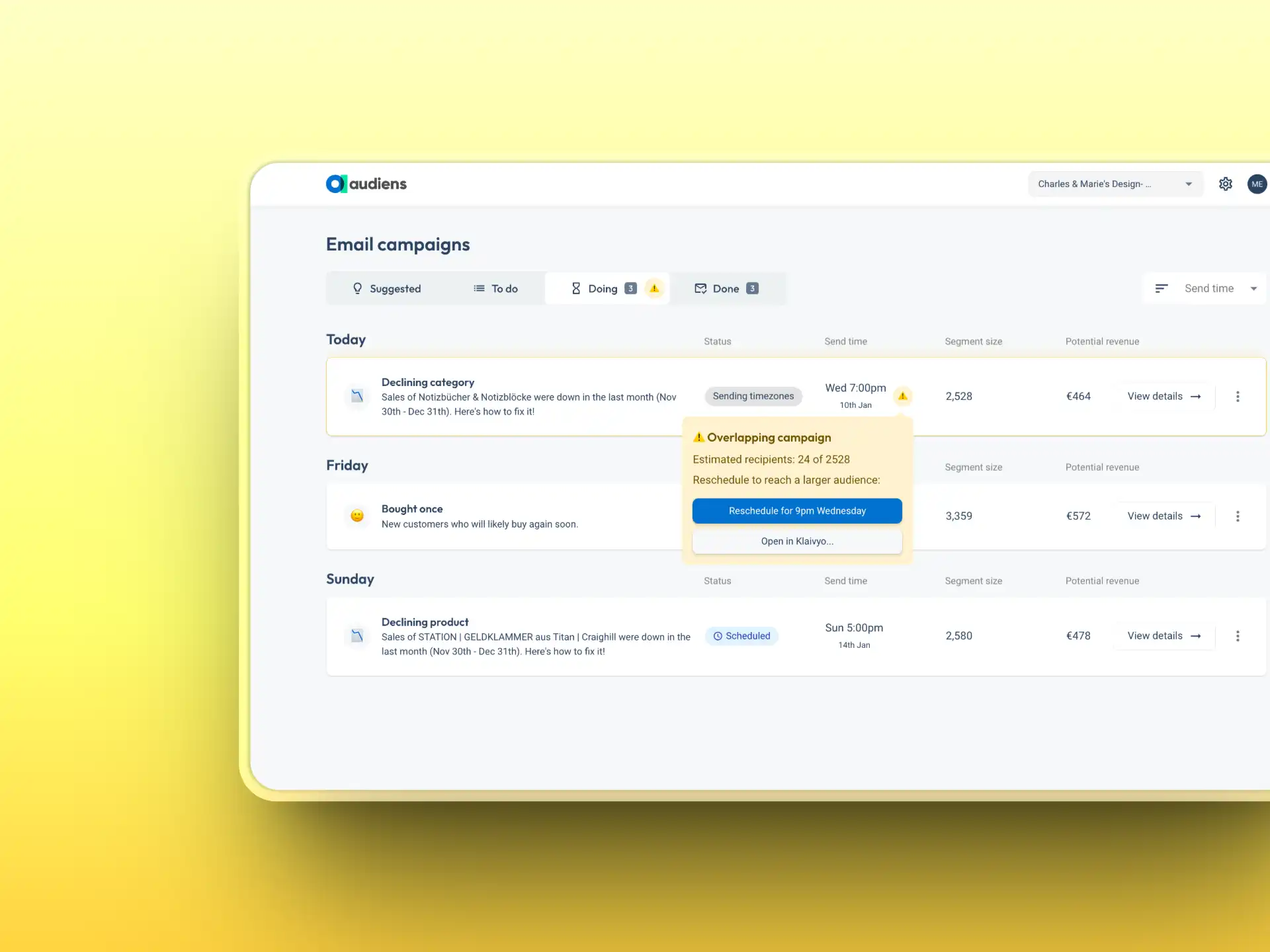
- Short titles and icons, reduced the time to understand our suggested campaigns.
- Improved layout with site navigation moved to the left side of the screen, knowing users scan from left to right.
These changes unlocked the first step of the user flow and increased traffic to the detail view of each campaign, increasing trust of our suggestions.
Step 2: Potential Revenue
Potential revenue is a metric that predicts the value of a suggested campaign. Originally displayed as a range of three numbers, users were required to assess 9 different values across the 3 suggestions, resulting in high levels of cognitive load.
I simplified this to a single potential revenue figure for each campaign, de-emphasising a metric that is at best an estimate. I reframed ‘Predicted revenue’ as ‘Potential revenue’ hinting it to be an achievable upper bound.
By adding the segment size, along with ‘Potential revenue’ and clearer titles, users could now compare suggested campaigns easily, making more informed decisions.
It was disheartening when most of the campaigns earned less than the revenue you predicted
Step 3: Reframing our Value
Problem
Users who sent campaigns were often left underwhelmed by their performance, in part due to the estimated revenue being overly optimistic and inaccurate. In reality we had limited control over the performance of a campaign with external factors such as the marketing copy and email design beyond our control.
Solutions
To solve this problem I removed the potential revenue from the results screen. Users were no longer framing the value of our product against overly optimistic revenue estimates. Instead, all revenue generated should be celebrated and seen as a positive. I also introduced the number of recipients, giving context for the performance of a campaign, with poor campaigns often affected by a low number of recipients. Finally I added the revenue per recipient metric. Users could now fairly judge how well campaigns were performing.
Audiens campaigns often outperformed traditional campaigns in revenue per recipient. Focussing solely on overall revenue was undervaluing our product.
Step 4: Campaign Details
Introducing the ‘view details’ button successfully guided many users to the in depth campaign screen for the first time.
This however, presented a new problem: the page itself left users feeling overwhelmed which then resulted in a high number of u-turns (Users exiting a page within 7 seconds).
To address this I redesigned the page with minimalist design, removing unnecessary content and reducing the overall word count by half, while inceasing information. A new layout and information achitecture provided a clear hierarchy.
These changes had a notable impact, reducing u-turns and increasing user engagement, allowing for more informed decisions on suggested campaigns.
Final Outcome
As a result of this work we saw more customers sending campaigns than ever, with the number of weekly campaigns sent beaten each week, regularly doubling the original record. The number of paying customers grew 14x in the space of 6 months, giving the business leverage when seeking further investment.
- +73%
- Users sending campaigns
- +169%
- Users sending 2+ campaigns
- 14x
- Paying customers
Thank you for reading!
And to those who worked with me on this project, I’d like to give a special mention to our engineers Greg Douglas and Piers Osborne